Liquify are official Shopify Experts & Partners since 2014. If you follow a link to Shopify from our website and make a subsequent purchase this may result in a commission at no extra cost to you. Our opinions remain our own.
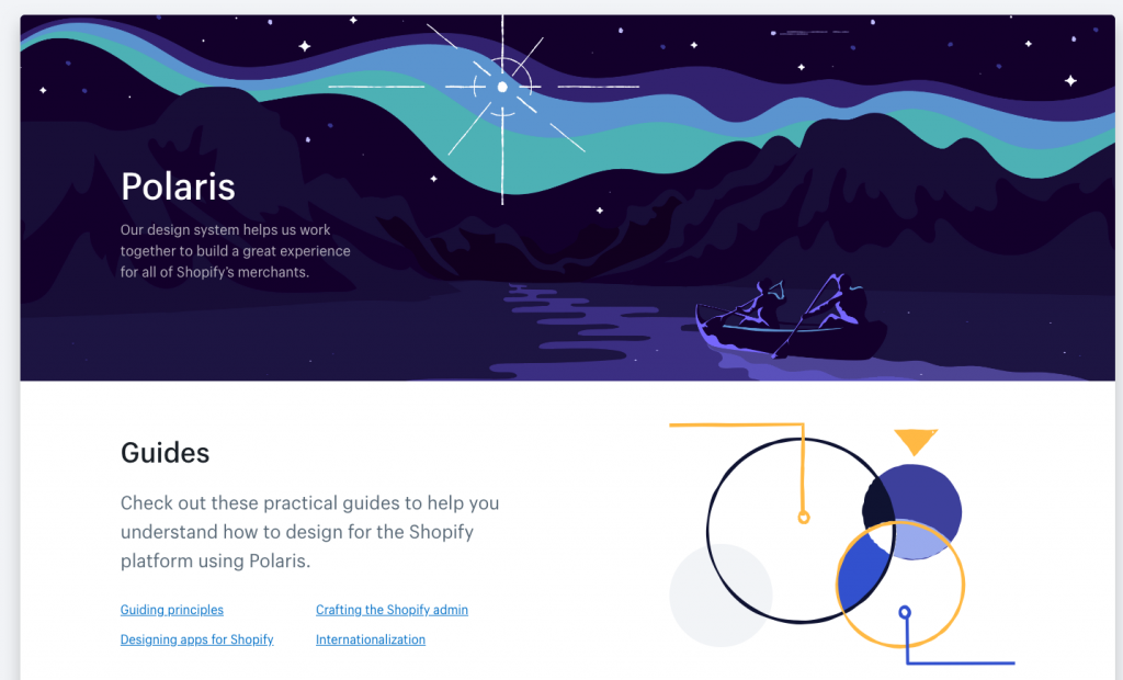
Shopify has introduced Shopify Polaris. A new design system that helps Shopify Designers and partners to create a consistent user experience for merchants. The system helps use best practices from Shopify’s own design team when developing new interfaces and apps.
What Is Shopify Polaris?
The Shopify Polaris design system is a set of comprehensive guidelines and principles that designers can use while building apps and channels for Shopify. It offers a range of resources and building elements like patterns, and is available to all Shopify partners. Instead of focusing on creating already-existing elements and mimicking design patterns, Shopify Designers can now focus on what really matters: providing solutions that blend in with Shopify seamlessly. This gives better user experience and keeps everything uniform and consistent.
The Polaris system holds all the building blocks needed to create apps that will feel familiar to merchants, and won’t require a learning curve. Plus, it allows partners to download a style guide, a library of components and patterns, and a UI kit they can use.
We’ve recently been using it to do some rapid prototyping for app development. And it’s saved us a tonne of time to work within a fixed design framework – even though we were sceptical at first about the benefits.

What Is Shopify Polaris Used For?
Shopify Polaris is used to build all the elements that make up a great user experience. From the app and channel content to design and layout patterns. The Polaris design system includes the following:
Guides
Guidelines and best practices on creating elements for Shopify admin and apps, incorporating accessibility and internationalisation options. The aim is to provide merchants with a fluid experience when switching between core Shopify and app functions. Because for usability they should look and feel the same.
Content
Guidelines and resources on using content to improve user experience. From writing product descriptions and using the right tone and voice, all the way to naming products and adding alternative text, this section covers best practices on utilising language as a powerful UX element. Here, designers can learn all about preferred date formats, the proper vocabulary for actions, and developing a strategic plan for language.
Design
Resources and guidelines on using colours, typography and illustrations, as well as best practices on sounds and icons. This section also covers the use of spacing, data visualisation, and interaction states.
Components
Includes a collection of readily available interface elements, including React and CSS components, that Shopify Designers can use to provide a consistent experience across channels and apps.
Patterns
Best practices for arranging the page layout: from screen structure to page components, standard layouts and navigation. This section also covers best practices for error messages including; types of messages, what colours to use, and the best way to display various error message types.
Getting Started With Shopify Polaris
Shopify Experts who want to design with Shopify Polaris will need to download the Sketch UI kit and React components first. These can be accessed from the main Polaris landing page.
To get them:
Scroll to “Resources” at the bottom of the page > click “View more resources” to get access to the downloads section.
There, you can also find links to helpful documentation, developer forums, and blogs. Plus, links to third-party tools that can further enhance what you are building.


